Website Logo Placement for Maximum Brand Recall
Showing a logo in the top left corner of a web page is probably the most common design pattern of all time. The logo serves as a landmark that orients users when they first land on a page and helps them identify the website they are visiting. A lot of research indicates that speakers of left-to-right languages look at the left side of the page first and often the first page element they attend to is the logo. (They also spend more time looking at the left side of the page overall.)
Right-Aligned Logos Thwart Web Conventions
A left-aligned logo is comfortable for users, but because it’s such a longstanding tradition, this standard is a tempting target to anyone wanting to appear unconventional. Violating this convention seems like an easy way of immediately distinguishing a design from its competitors, and standing out from the crowd. For example, the website homepage shown below for the New York Edition hotel mirrors the traditional layout and displays both the hotel name and the navigation menu on the right edge of the page.
Does Placement Really Matter?
Clearly it’s possible to disregard the standard for top-left logo placement and still end up with a reasonable website. If you were to show users the website above and ask them what the name of the hotel is, they’d be able to figure it out. It’s easy to see how a designer might decide that conforming to traditional web guidelines is less important than creating a unique brand experience by using an unusual layout.
But before committing to this course of action, you should make sure you know exactly what you’re giving up.
To find out if there are actual consequences to nonstandard logo placements, we compared user reactions to 4 different hotel websites:
- For each site, users were randomly assigned to see either the actual website design, or a version we manipulated to change the position of the logo and the navigation to display on the opposite part of the screen
- Users looked at each website for about a minute, and rated their perception of whether the hotel was welcoming, unique, stylish, and somewhere they would like to stay.
- Users saw 5 different websites (in a randomized order), and subsequently answered some unrelated demographic questions (to minimize the recency effects that may have improved their memory of the last seen site).
- Finally, users were presented with a list of 10 hotels and asked to select the ones they’d seen and rated in the earlier questions. (This type of aided recall test is commonly used in market research to assess advertising effectiveness.)
In total, 128 users participated in the study, which we ran with UserZoom (one of our preferred remote user-testingservices).
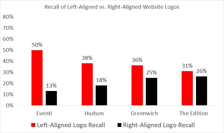
As you’ll see below, placement definitely does matter, at least if you want users to actually remember your brand. People were significantly more likely to remember the name of a hotel when the logo had been positioned in the top left corner of a website, compared to in the top right corner.
Left vs. Right Logo Placement
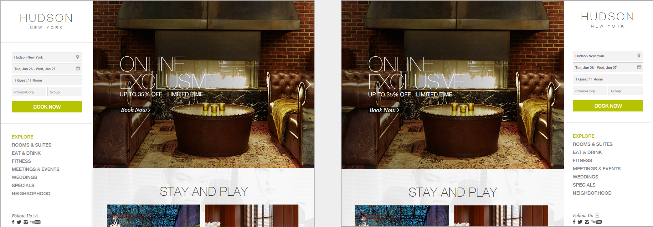
The comparison of left vs. right logo placement used images like the ones shown below: the real website for the Hudson hotel on the left, with its left-aligned logo, and our manipulated version on the right, with the logo and navigation flipped to the less conventional right-side placement.
For every design we compared, we found that more users remembered the brand name when it was displayed on the left side of the page, rather than the right side. This difference was statistically significant (using a chi-squared test to compare the number of times the brand was recalled for left vs. right logo positioning, p<0.05.)
The brand recall was as follows, averaged across the 4 sites we tested:
| Logo Position | Average Brand Recall |
| Left | 39% |
| Right | 21% |
The average lift in brand recall was thus 89% by having the logo on the left instead of the right. This is one of the biggest differences we have seen in user-experience metrics from such a small layout change.
(Our user testing in countries with right-to-left scripts has found that many of the traditional web-page layout guidelines are mirrored, as one might expect. For example, these users scan down the right side of the text. Thus, it is likely that our findings for logo placement might also be mirrored, causing the best logo placement to be on the right. However, we have not done that study and can’t say for sure.)
Do Unusual Logo Positions Make a Brand Seem ‘Unique’?
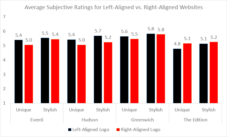
Aside from the memorability, what about the less tangible effects? Did users perceive websites with nontraditional placements to be more unique or stylish?
In a word, no. There were no statistically significant differences (according to a two-sample t-test) in how people rated the hotels with traditional left-aligned logos, compared to the ‘unconventional’ right-aligned logos. In fact, in most cases, the left-aligned logos were rated slightly more ‘unique’ and ‘stylish’ (though again, these differences were not significant.) There were also no statistically significant differences between left-align logo design and right-aligned logo designs in the two other dimensions that users rated: whether the hotel seemed ‘welcoming’ and whether they would like to stay at the hotel.
Visual Design for Effective Website Branding
Branding and visual design involve complex interactions of perception and user expectations, and seemingly minor details can have a big unintended effect. For example, when preparing the designs for this study, we noticed that hotel names written in difficult-to-decipher script were much less likely to be remembered at all, regardless of their position.
There is no formula that can tell you exactly what your website should look like. But it’s clear from this research that you can’t rely on shortcuts like disregarding standard web conventions to make your site look special. People are attracted to novelty, but we’re also creatures of habit who rely on patterns to make sense of the world. When you break these patterns, you risk losing people’s attention altogether.
Source: https://www.nngroup.com/articles/logo-placement-brand-recall/