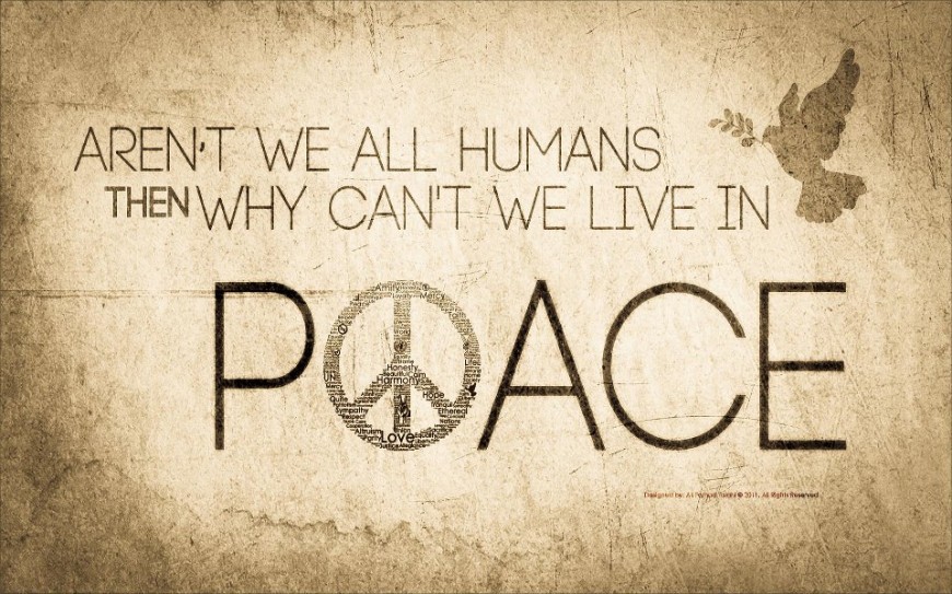
Why good graphic design is SO important
A good design incorporates both function and aesthetics. A well-designed object does not differentiate between form and function, but rather incorporates them into one single, coherent concept. This is the primary aim of designers—to communicate an idea without making the aesthetic component suffer.
A concept the following designs failed miserably at.
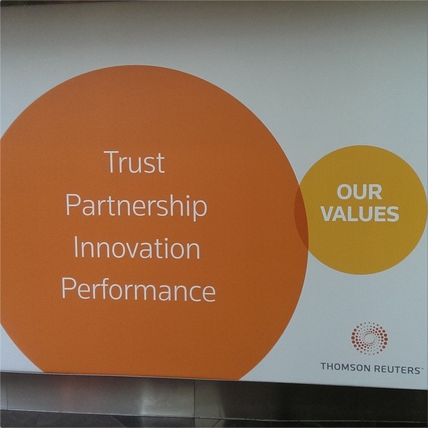
Subreddit /r/CrappyDesign is one of the subreddits that we highly recommend you to visit. And for a good reason. There are a lot of blog posts and articles in the internet that collates good designs and what makes the design effective. This subreddit is the opposite.
This subreddit was created by Daniel Allen, a UX interaction designer from Chicago. He was also the creator of Karmajobs, a a reddit jobs search engine, and did design work on print and in the web including Discovery Communications and Reddit Enhancement Suite.
In an interview from NewCity, Dan Allen said “It was more for my own consumption than anything. I feel an obligation to call out bad design because the people perpetuating it at the professional level should know better.”
The Crappy Design subreddit’s own interface pays homage to its namesake with its Comic Sans font and crazy use of color gradients and WordArt reminiscent of 90s-era websites.
As a designer, there is something addictive about looking at these godawful designs. Whether it is simply happiness with others’ misdesign or something else, let this be a reminder of what not to do when designing.
Admit it though, you have at least one crappy design hidden within the recesses of your design portfolio.
In any case, check out some of the crappiest designs featured in the subreddit:
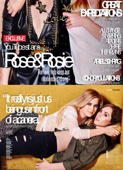
I think there is a kerning problem

I think there is a justification problem

R U up for the hallenge?
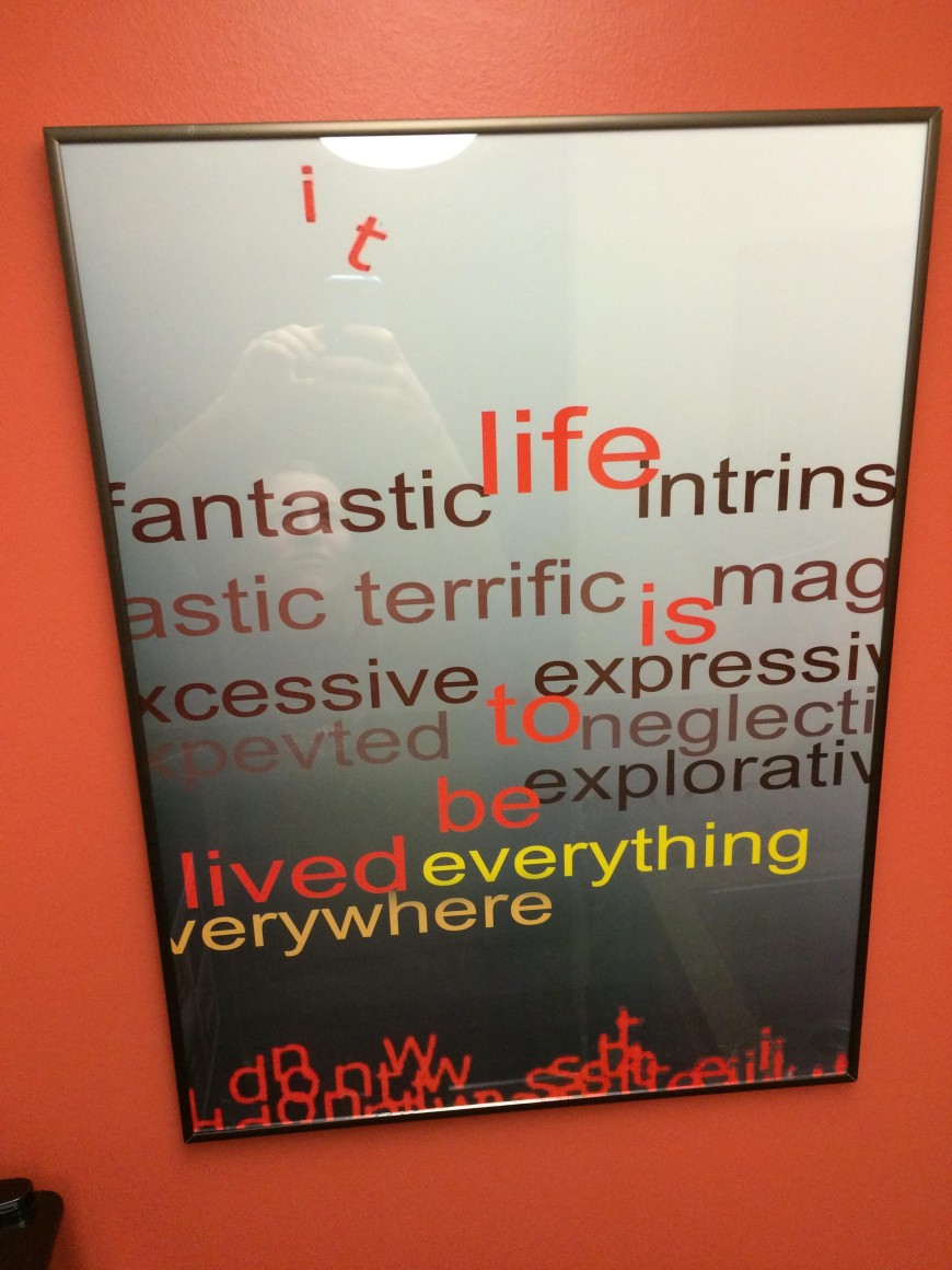
But is it art?

More Comic Sans!

POECE be with you

There’s something about that last ‘g’ that feels off.
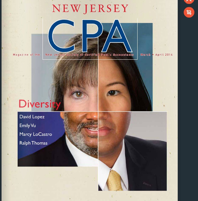
We need photo size diversity too.

This is what we call ‘irony’.

I think you forgot to Photoshop something...
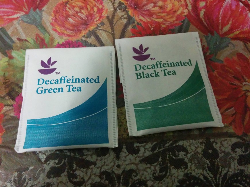
Are we seeing another blue and black/white and gold phenomenon?
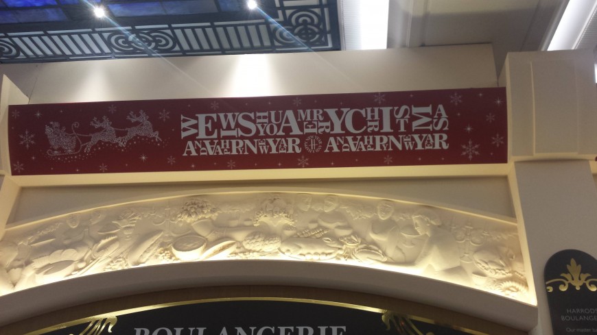
And this says...?
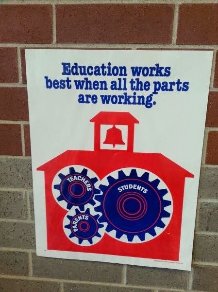
Something about those gears just don't work together
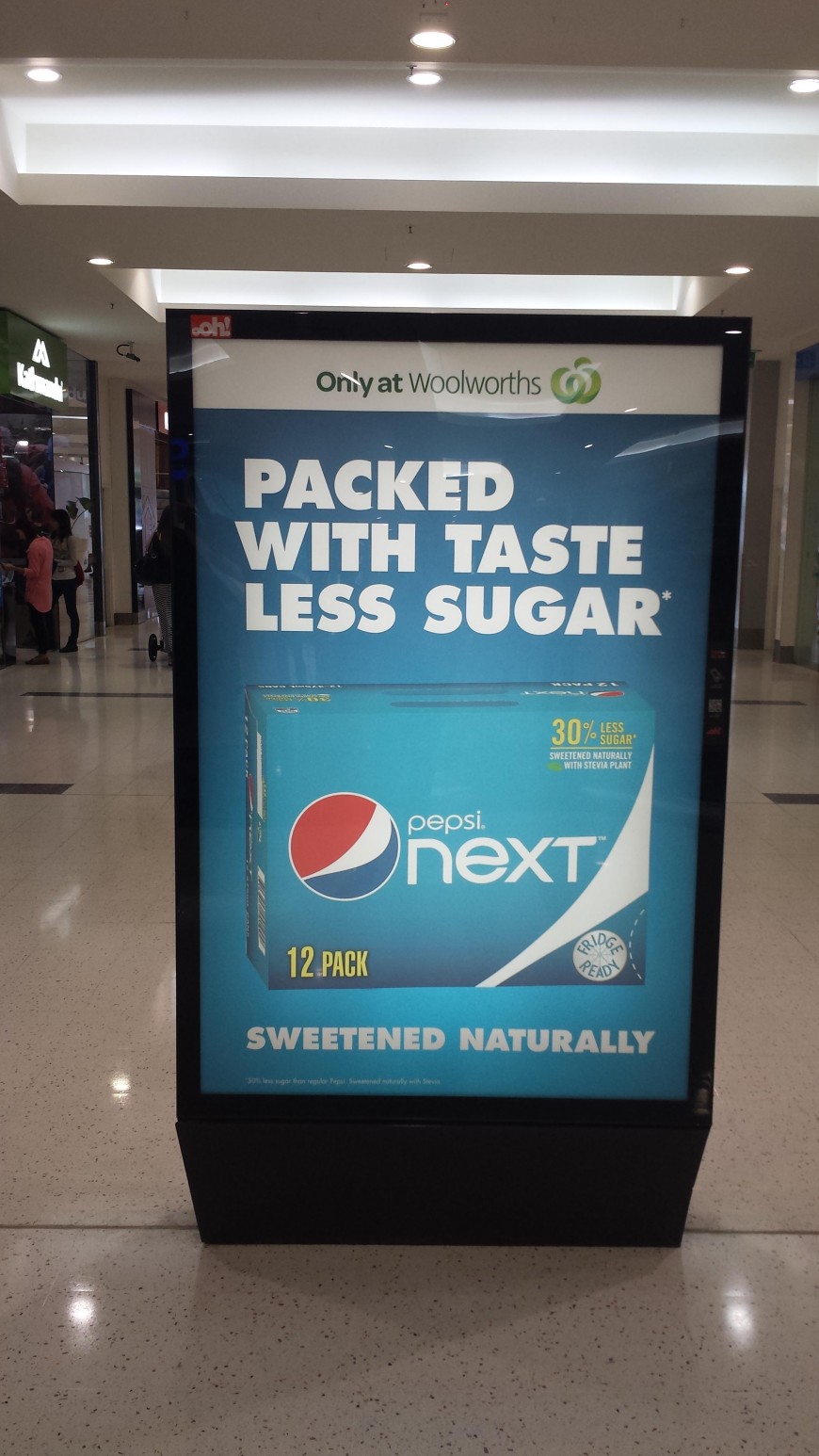
Tasteless sugar?

It’s all about the visuals.

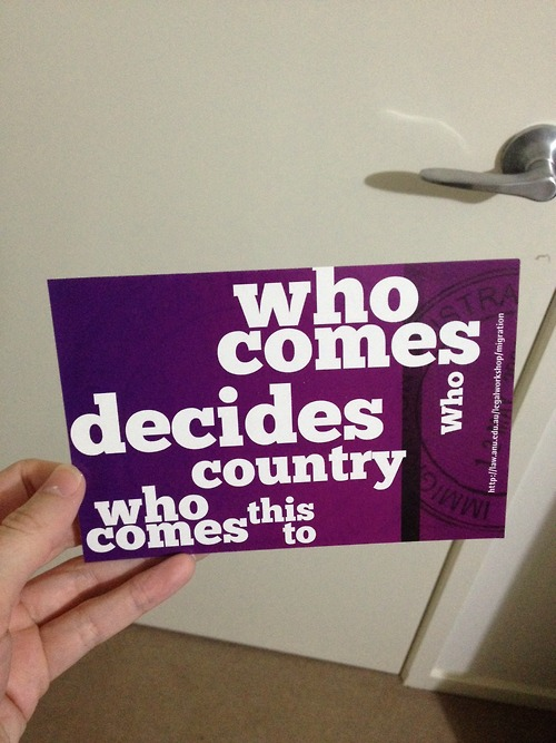
Who comes decides who country who comes this to?

Let me click it, darn it!
For more crappy design inspiration, visit /r/CrappyDesign.