Web design trends for 2023
Web design has come a long way in the past decade. Over the past year, we have seen some significant changes in web design that have transformed the way websites look and feel. In this post, we will explore the difference in web design over the last year versus the previous five years and take a closer look at what's new.
Responsive Design
One of the most significant changes in web design over the past year is the emphasis on responsive design. Responsive design is an approach to web design that aims to provide the optimal viewing experience for users on all devices, including desktops, tablets, and smartphones. It has been around for several years, but over the past year, there has been a greater focus on creating websites that are not only responsive but also load quickly on mobile devices.

Mobile-First Design
Mobile-first design is another trend that has gained momentum over the past year. Mobile-first design is an approach to web design that focuses on designing for mobile devices first, then scaling up to desktop devices. This approach makes sense given that more people are using mobile devices to access the internet than ever before. As a result, websites that are designed with mobile devices in mind tend to perform better in search engine rankings and provide a better user experience overall.

Flat Design
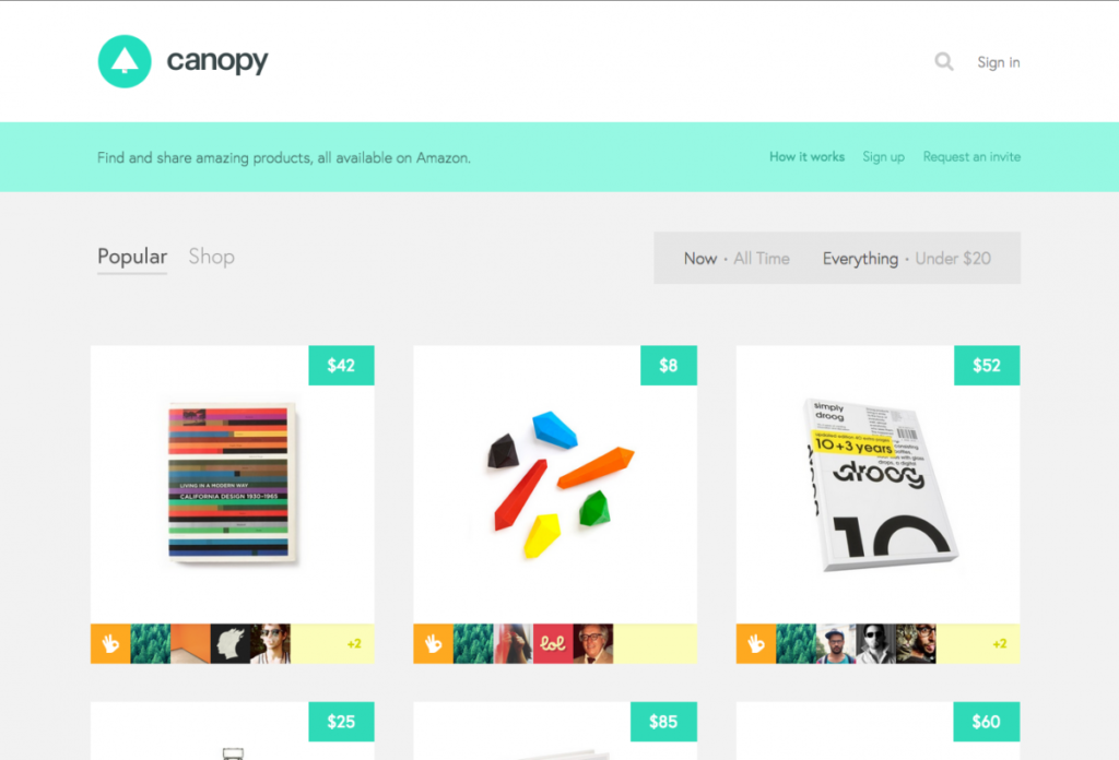
Flat design is a design style that has been around for several years, but it has gained even more popularity over the past year. Flat design is characterized by its minimalism, use of bright colors, and simple typography. It is a departure from the more complex, textured designs that were popular a few years ago. Flat design is particularly effective for mobile devices because it loads quickly and is easy to navigate.
Microinteractions
Microinteractions are small animations or visual cues that provide feedback to users. They are a subtle but effective way to improve the user experience of a website. Over the past year, there has been a greater emphasis on microinteractions in web design. From small hover effects to complex loading animations, microinteractions add personality and charm to a website.
Minimalism
The trend toward minimalism in web design has been ongoing for several years now, but it has continued to gain momentum in the last year. Minimalism involves using simple, clean design elements and layouts to create a more streamlined user experience.
More Emphasis on Accessibility
Accessibility has been an important consideration in web design for several years, but over the past year, there has been a greater emphasis on making websites accessible to all users. This includes designing websites that are easy to navigate with a keyboard, providing alt text for images, and using high contrast colors for text.

The Rise of Dark Mode
Dark mode is a color scheme that uses dark backgrounds and light text. It has been around for a few years, but it has gained even more popularity over the past year. Dark mode is particularly effective for mobile devices because it reduces eye strain and conserves battery life. Many websites and apps now offer a dark mode option, which is a testament to its growing popularity.

Bold typography
The use of bold typography has been on the rise in the last year, as designers are looking for ways to make their websites stand out in a crowded online space. Bold typography can help draw attention to key elements of a website, and create a sense of hierarchy.
Web Design Tools and Technologies
Web design tools and technologies have evolved significantly over the past year. There are now more tools than ever before to help designers create responsive, accessible, and visually appealing websites. Some of the most popular tools include Figma, Sketch, and Adobe XD. These tools allow designers to create prototypes, collaborate with team members, and test designs across multiple devices.
In terms of technologies, there has been a greater emphasis on using CSS Grid and Flexbox for layout. These technologies make it easier to create complex layouts without relying on frameworks or libraries.
Conclusion
In conclusion, web design has undergone some significant changes over the past year. There has been a greater emphasis on responsive design, mobile-first design, flat design, microinteractions, accessibility, and dark mode. Additionally, web design tools and technologies have evolved significantly, making it easier for designers to create visually appealing and accessible websites. As we move forward, it will be interesting to see what new trends and technologies emerge.